

网页加载的时候先显示一个动画,等加载完成后,再显示网页,这样做过度比较自然。用户体验感比较好。
原理
原理是,给网页顶部放一个元素,元素占满全屏,加载完成后,再通过JS移除这个元素即可。
简单在网页顶部写个代码,一个div,作为容器,然后设置样式,给占满全屏。
<style>
    .loading-animations {
        background: #666;
        position: fixed;
        left: 0;
        right: 0;
        top: 0;
        bottom: 0;
        z-index: 9999;
    }
</style>
<div class="loading-animations" id="loading-warp"></div>
接下来,监听网页事件,加载完成后,给移除他,或者设置样式display为none。
网页加载完成事件有window.onload,但是这个要覆盖其他的方法,所以使用监听器最好
window.addEventListener('load', function () {
let loader = document.getElementById("loading-warp");
loader.style.display = "none"
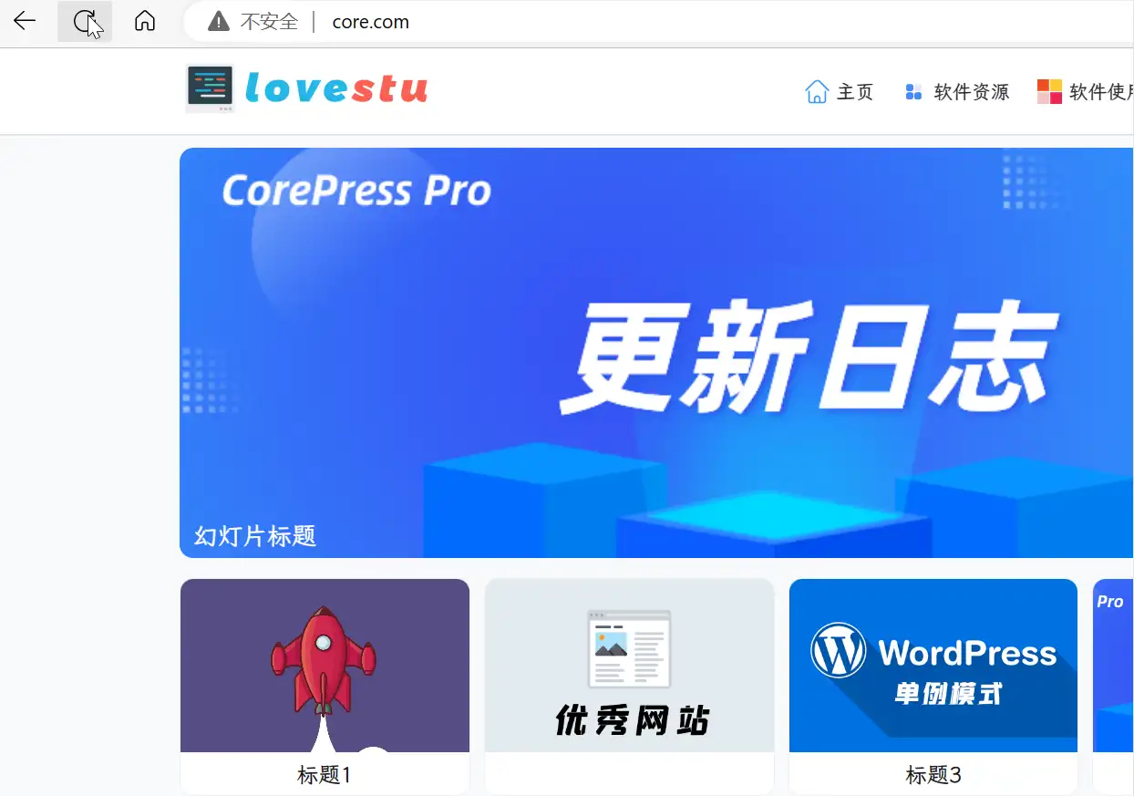
});效果如下:
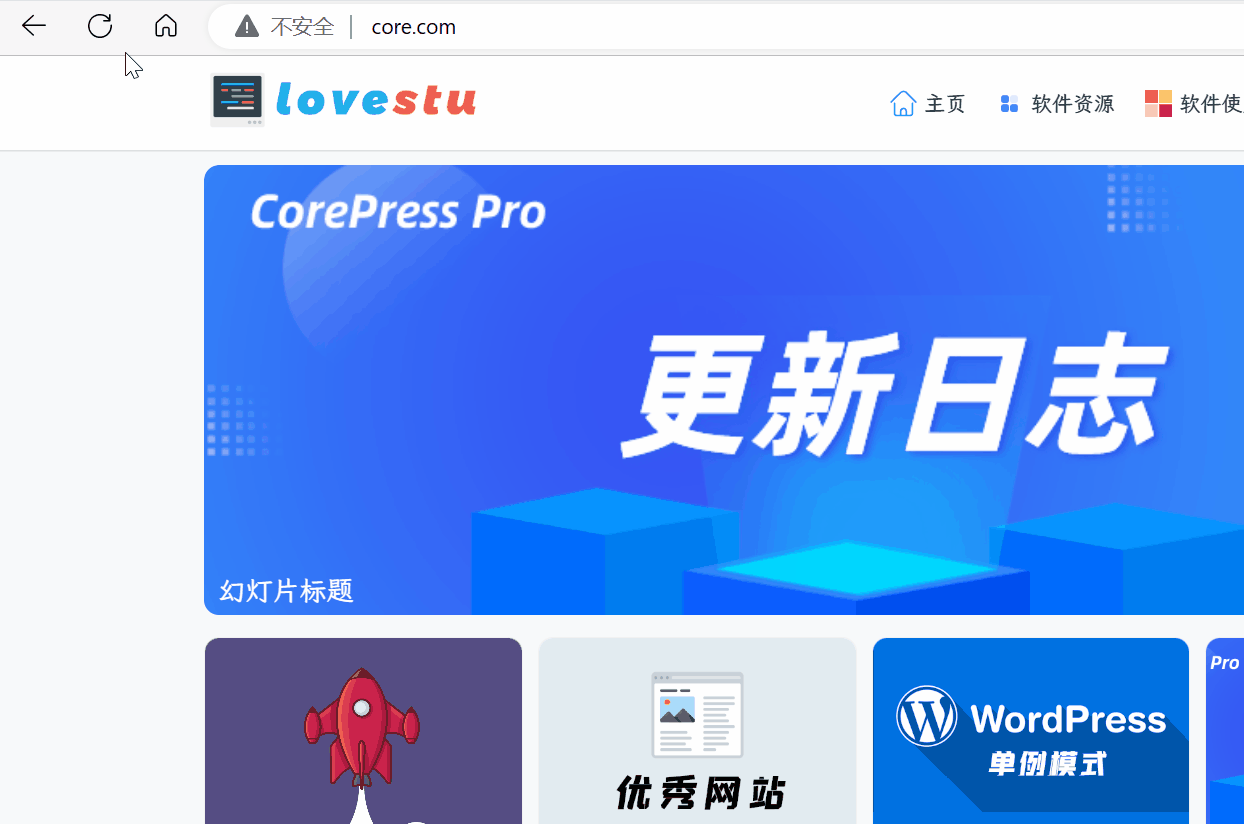
看得出来,比较生硬。并且没有任何东西,就是全屏展示,然后等待网页加载完消失。
这个时候,修改一下样式。给网页添加一个渐变效果,在消失的时候,缓慢消失。
修改上面的style,加入了一个transition动画,和opacity透明度。默认为1
    .loading-animations {

        background: #666;
        position: fixed;
        left: 0;
        right: 0;
        top: 0;
        bottom: 0;
        z-index: 9999;
        transition: 1s;
        opacity: 1;
    }

    .loading-animations-out {
         opacity: 0;
    }
等网页加载完成后,给元素添加上loading-animations-out类,就可以实现渐变消失。
消失以后,等待1秒,将元素移除即可。
 window.addEventListener('load', function () {
        let loader = document.getElementById("loading-warp");
        loader.className = "loading-animations loading-animations-out";//使用渐隐的方法淡出loading page
        setTimeout(() => {
            loader.style.display = "none"
        }, 1000);
    });
那么,实现效果会这样
进阶
都这么做了,那么再搞个加载图就完事大吉了。
不过对于前端来说,使用图片,会再一次请求服务器。用户第一次访问的时候,图片可能加载不出来。所以,使用svg输出内容,或者使用css动画,最合适。
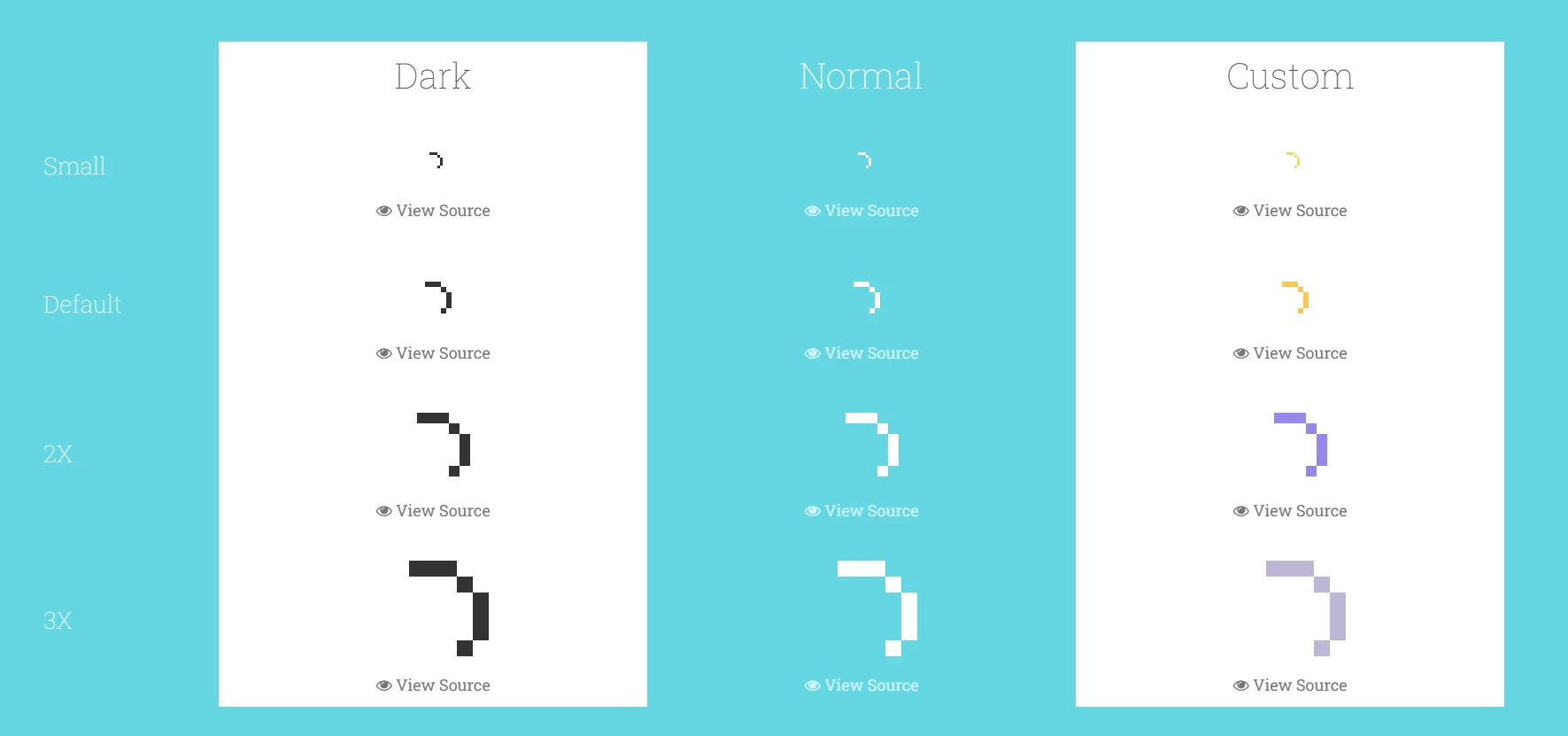
既然CSS动画了,那就看一个网站吧:
https://labs.danielcardoso.net/load-awesome/animations.html
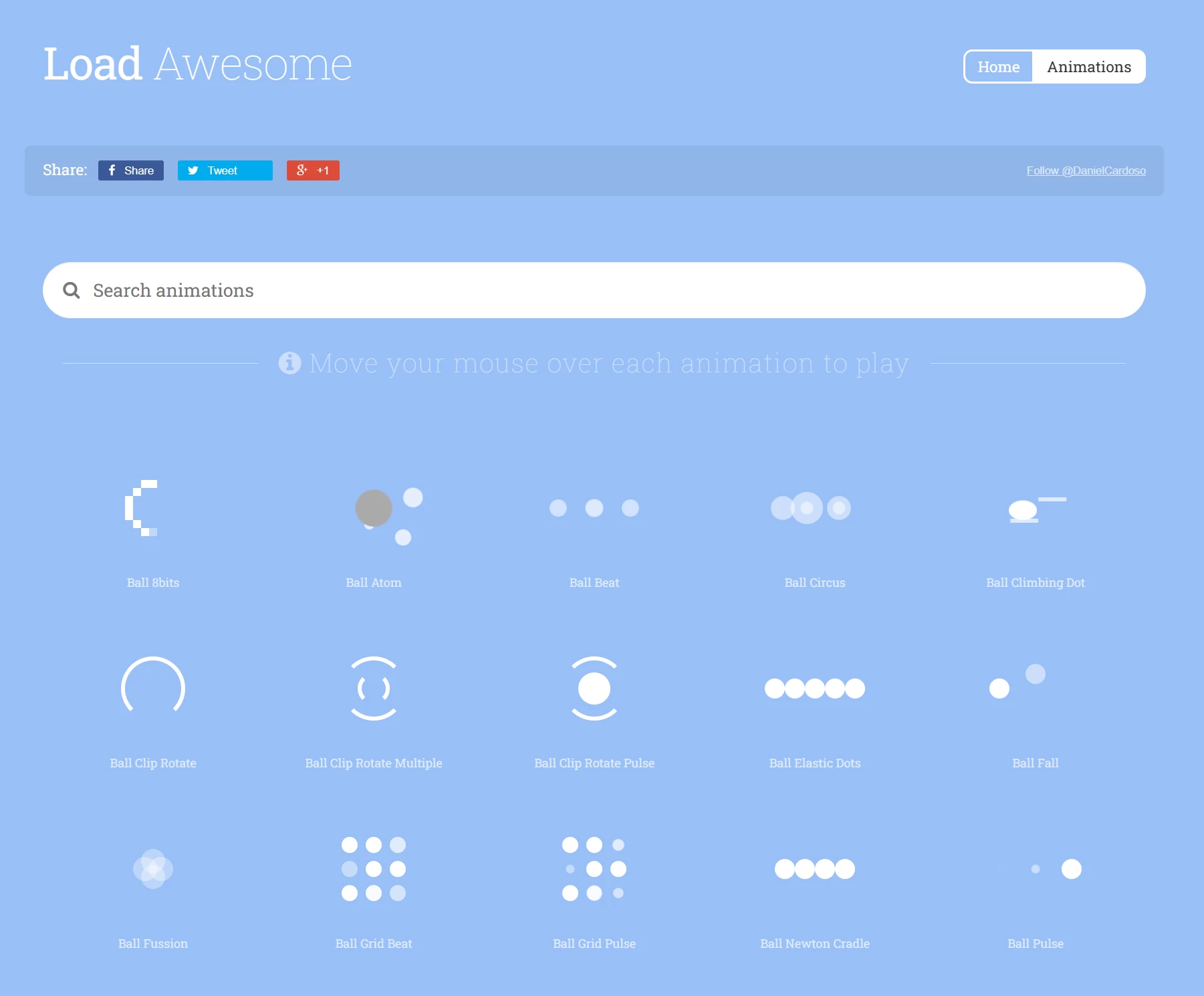
网站包含了很多CSS加载动画,html内容和css内容都贴出来了。
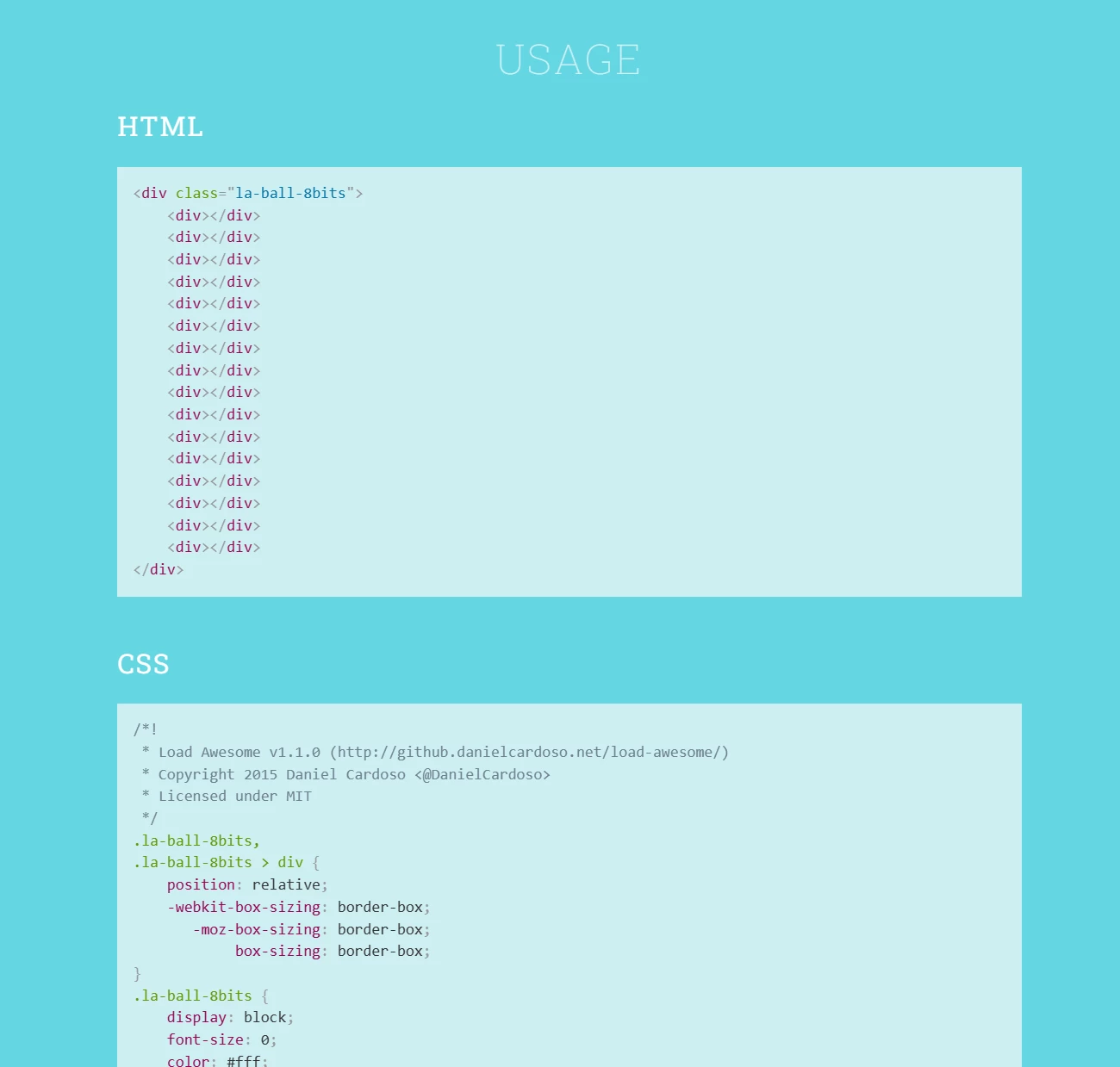
甚至还有不同样式和大小的代码
接下来,再修改代码内容。
主要在样式里面,将元素容器设置为flex,垂直居中。(选了一个简单的动画,不然代码有点多。)
<style>
 .loading-animations
 {
 background: #666;
        position: fixed;
        left: 0;
        right: 0;
        top: 0;
        bottom: 0;
        z-index: 9999;
        display: flex;
        align-items: center;
        justify-content: center;
        transition: 1s;
        opacity: 1;
}
.la-ball-clip-rotate,
.la-ball-clip-rotate > div {
    position: relative;
    -webkit-box-sizing: border-box;
       -moz-box-sizing: border-box;
            box-sizing: border-box;
}
.la-ball-clip-rotate {
    display: block;
    font-size: 0;
    color: #fff;
}
.la-ball-clip-rotate.la-dark {
    color: #333;
}
.la-ball-clip-rotate > div {
    display: inline-block;
    float: none;
    background-color: currentColor;
    border: 0 solid currentColor;
}
.la-ball-clip-rotate {
    width: 32px;
    height: 32px;
}
.la-ball-clip-rotate > div {
    width: 32px;
    height: 32px;
    background: transparent;
    border-width: 2px;
    border-bottom-color: transparent;
    border-radius: 100%;
    -webkit-animation: ball-clip-rotate .75s linear infinite;
       -moz-animation: ball-clip-rotate .75s linear infinite;
         -o-animation: ball-clip-rotate .75s linear infinite;
            animation: ball-clip-rotate .75s linear infinite;
}
.la-ball-clip-rotate.la-sm {
    width: 16px;
    height: 16px;
}
.la-ball-clip-rotate.la-sm > div {
    width: 16px;
    height: 16px;
    border-width: 1px;
}
.la-ball-clip-rotate.la-2x {
    width: 64px;
    height: 64px;
}
.la-ball-clip-rotate.la-2x > div {
    width: 64px;
    height: 64px;
    border-width: 4px;
}
.la-ball-clip-rotate.la-3x {
    width: 96px;
    height: 96px;
}
.la-ball-clip-rotate.la-3x > div {
    width: 96px;
    height: 96px;
    border-width: 6px;
}
/*
 * Animation
 */
@-webkit-keyframes ball-clip-rotate {
    0% {
        -webkit-transform: rotate(0deg);
                transform: rotate(0deg);
    }
    50% {
        -webkit-transform: rotate(180deg);
                transform: rotate(180deg);
    }
    100% {
        -webkit-transform: rotate(360deg);
                transform: rotate(360deg);
    }
}
@-moz-keyframes ball-clip-rotate {
    0% {
        -moz-transform: rotate(0deg);
             transform: rotate(0deg);
    }
    50% {
        -moz-transform: rotate(180deg);
             transform: rotate(180deg);
    }
    100% {
        -moz-transform: rotate(360deg);
             transform: rotate(360deg);
    }
}
@-o-keyframes ball-clip-rotate {
    0% {
        -o-transform: rotate(0deg);
           transform: rotate(0deg);
    }
    50% {
        -o-transform: rotate(180deg);
           transform: rotate(180deg);
    }
    100% {
        -o-transform: rotate(360deg);
           transform: rotate(360deg);
    }
}
@keyframes ball-clip-rotate {
    0% {
        -webkit-transform: rotate(0deg);
           -moz-transform: rotate(0deg);
             -o-transform: rotate(0deg);
                transform: rotate(0deg);
    }
    50% {
        -webkit-transform: rotate(180deg);
           -moz-transform: rotate(180deg);
             -o-transform: rotate(180deg);
                transform: rotate(180deg);
    }
    100% {
        -webkit-transform: rotate(360deg);
           -moz-transform: rotate(360deg);
             -o-transform: rotate(360deg);
                transform: rotate(360deg);
    }
}
</style>
<div class="loading-animations" id="loading-warp">
<div class="la-ball-clip-rotate">
	<div></div>
</div>
</div>
这样,效果就比较不错了。
当然,还有很多优化的,例如背景颜色,加载样式大小什么的。


